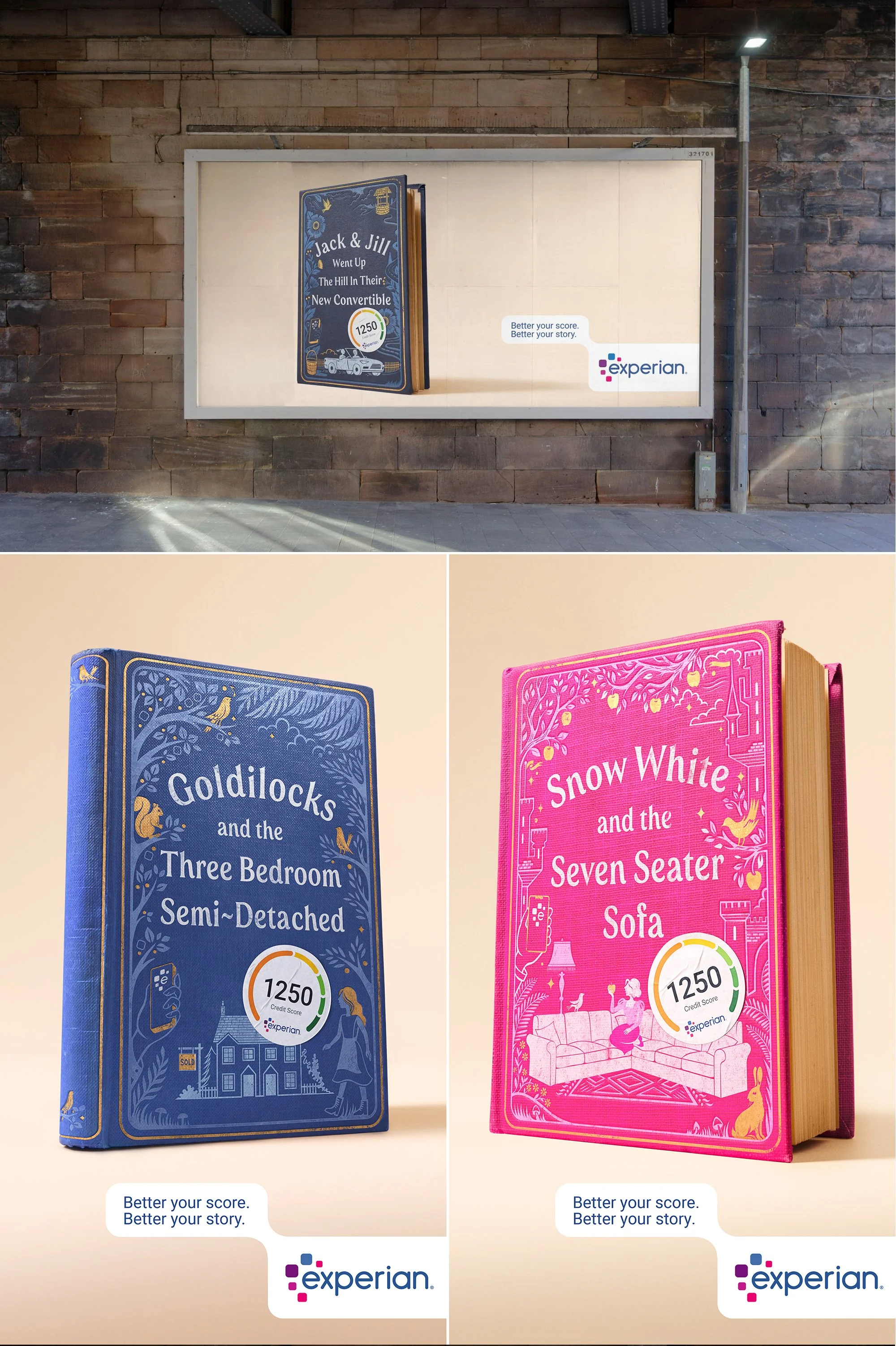
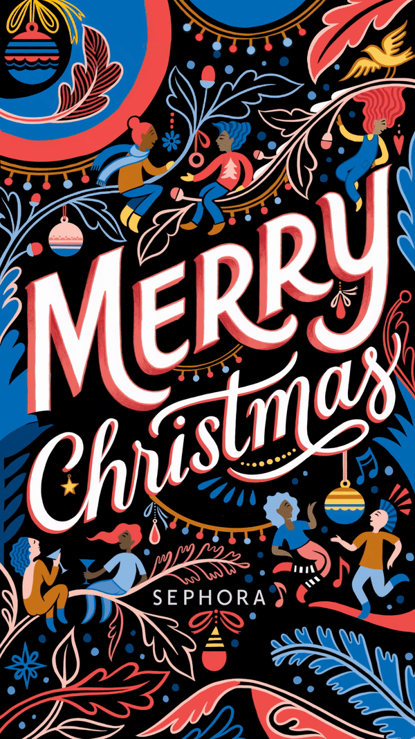
I was delighted to be commissioned by advertising agency BBH to illustrate their new campaign for Experian, empowering customers to take control of their financial futures with their inspiring new brand platform. The concept of the campaign uses classic nursery rhymes and fairy tales to encourage you to; ‘Better Your Story’ and improve your credit score. My job was to come up with a series of traditional, illustrated book covers – but with a twist!
The billboards went up all across London this week and have got lots of attention so far with their overall message of positivity and hope – just what we need in gloomy January!
A personal piece I have been working on which has been kindly animated by Jack Snelling who is awesome…
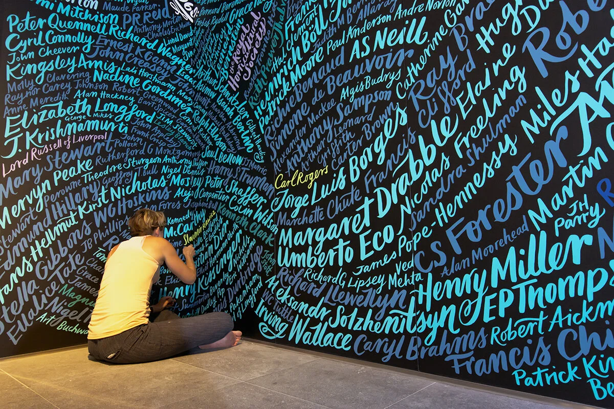
I was commissioned by The Graphic History Company and publishing giant, Hachette, to create this sprawling mural across six floors of their brand new headquarters in central London. The brief was to create a typographic piece of art which incorporated the names of nearly 4000 authors published by the various imprints of Hachette since 1768. My idea was to hand letter each name to create this inky, flowing design running from the lower ground floor, right up to the top floor along the lift lobby walls and stairwells throughout the building. I chose the colours to add to the dynamic, water-like effect, aimed to reflect it's stunning Thameside location.
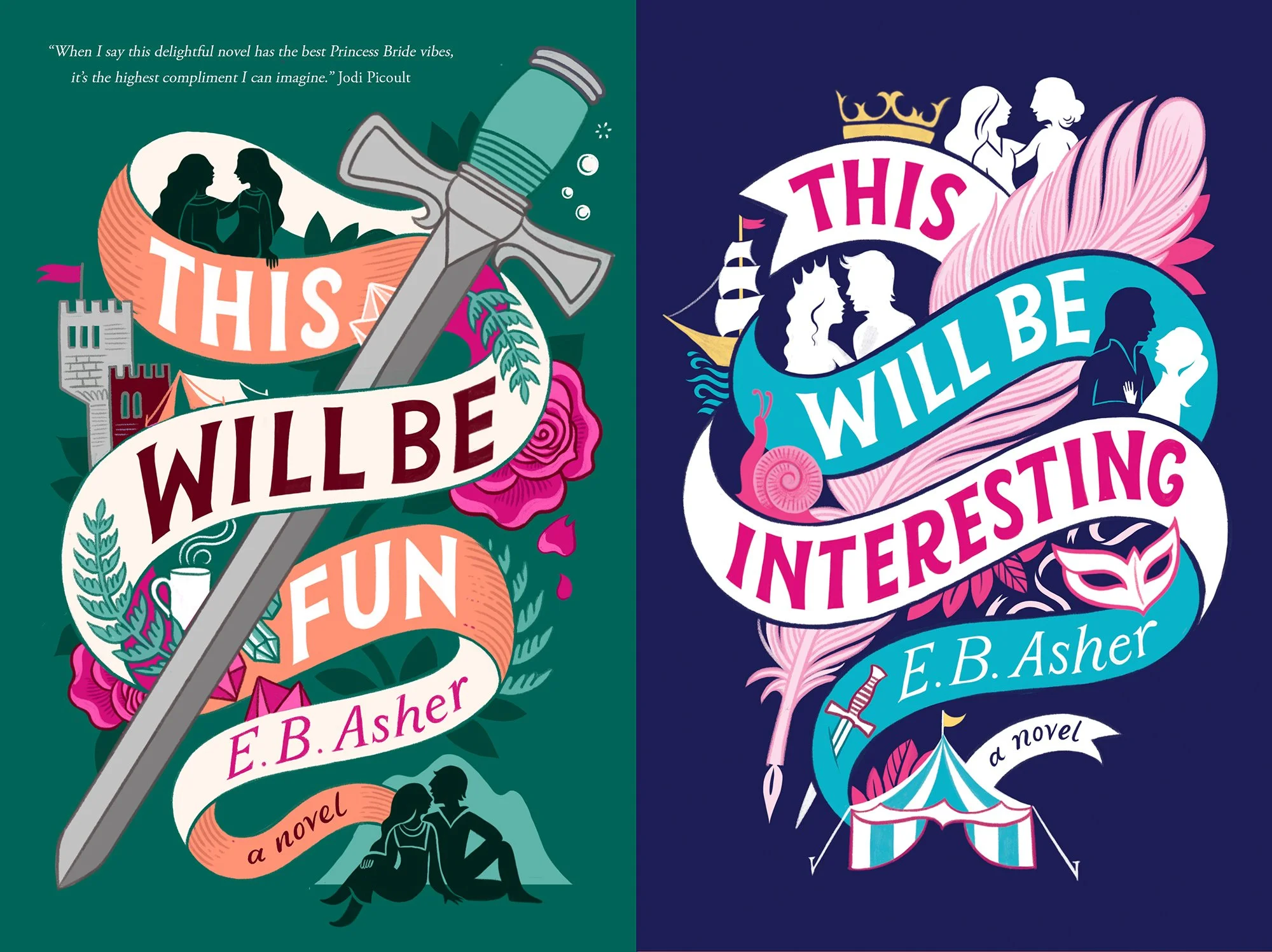
A dreamy commission for Solaris / Rebellion publishing to illustrate these YA fantasy covers.
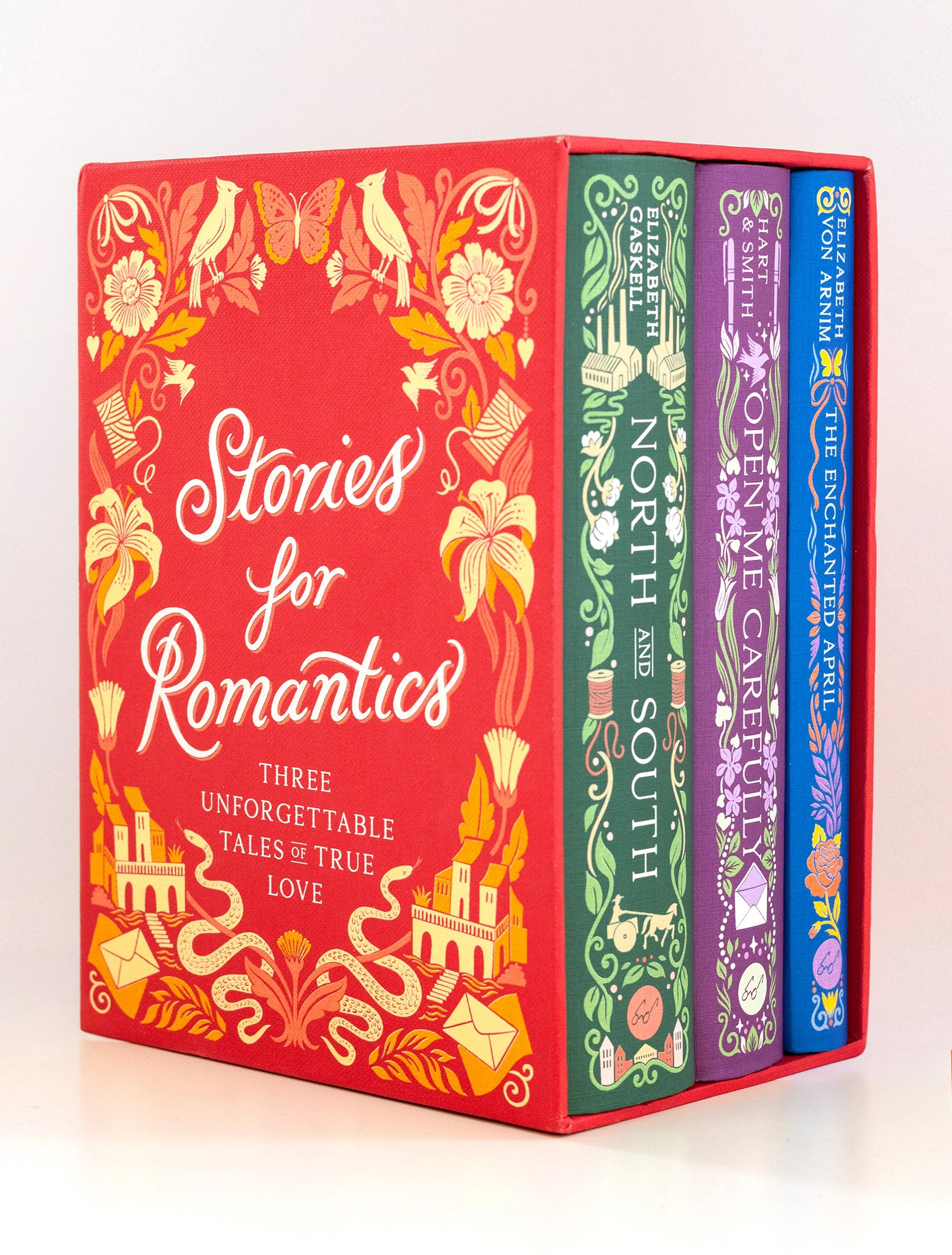
US publishers, Chronicle Books, approached me to design a boxed set of 3 classic novels as a collection of 'Stories for Romantics.' I was given the lovely, open brief to come up with a series style for the 3 covers and ornate slipcase as well as intricate patterned end papers and border illustrations for the back and interior pages. I chose a bright palette for this series - including the bright red slipcase - just in time for Valentines day!
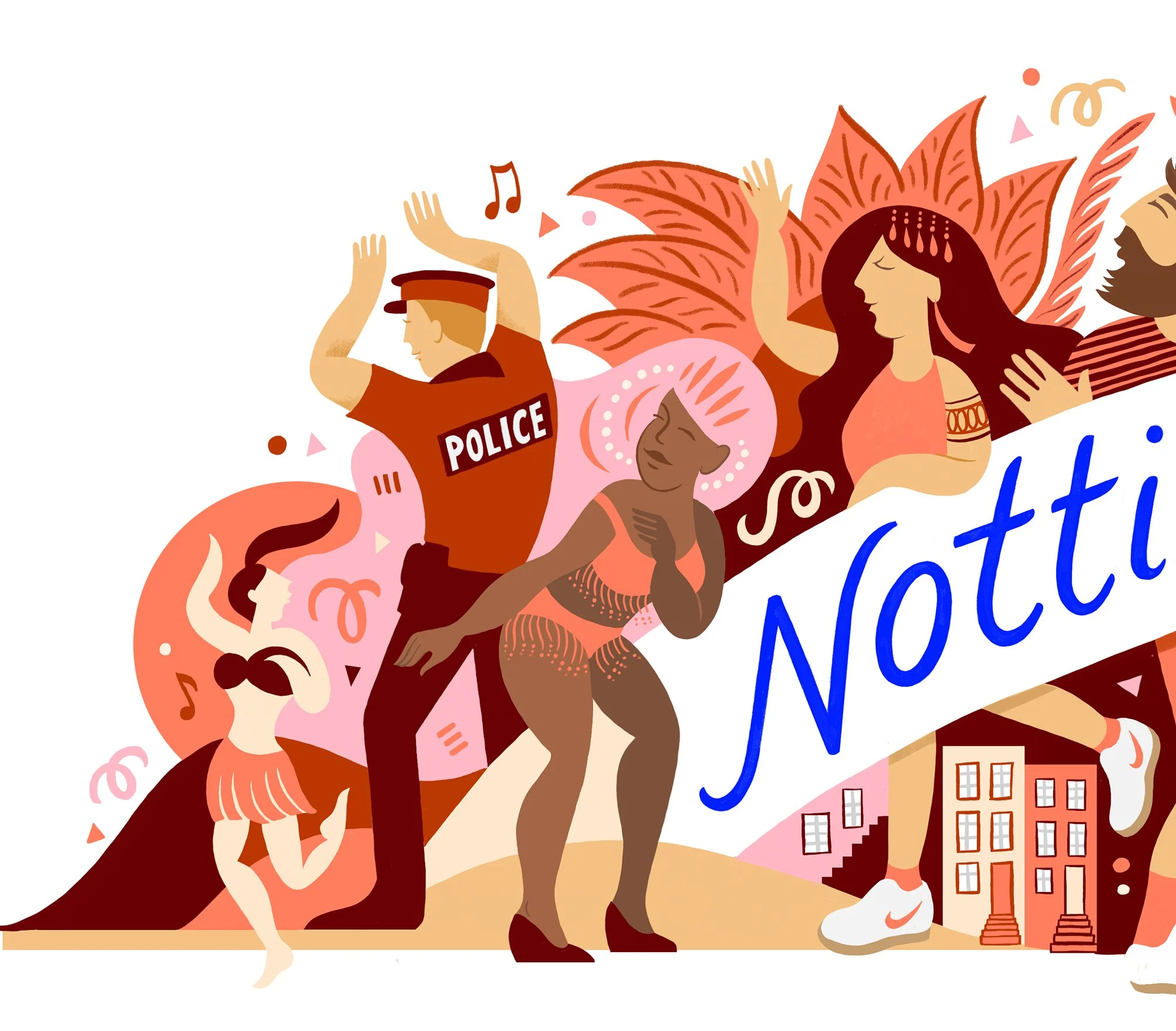
If you had a chance to visit Brighton this summer, you may have spotted my colourful additions to the streets. In celebration of the lifting of lockdown measures and social distancing, the PR team at Brilliant Brighton approached me to create some bespoke artwork to brighten the streets during the summer months. I explored the themes of kindness and community with these giant banner illustrations and matching wrap-around patterns for the street planters.
I was already a fan of this magical tale when I was asked by Penguin Random House to reimagine the cover for a new paperback edition which was then adapted for the rerelease of the hardback. When I design a cover, I usually want the lettering to be the hero, but in this case, I wanted a more simple, pared-back title to contrast with the illustrative hocus pocus happening all around...
I was commissioned by Pavement design to hand letter the packaging for BOTH burger
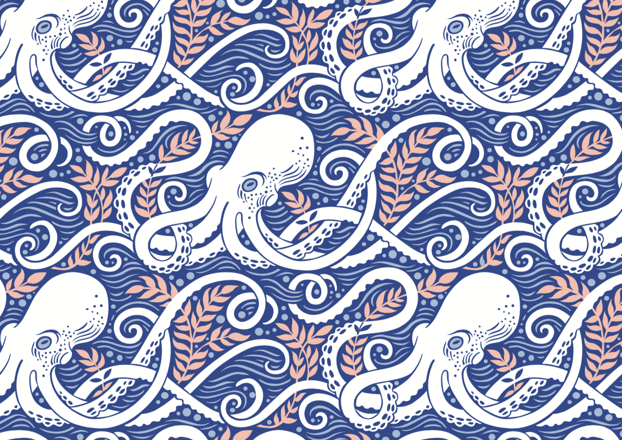
Watch this space for fabric, wallpaper and more…
I worked with design agency The Way Up to illustrate the festive packaging for KP Nuts Christmas caddys in all their traditional flavors.
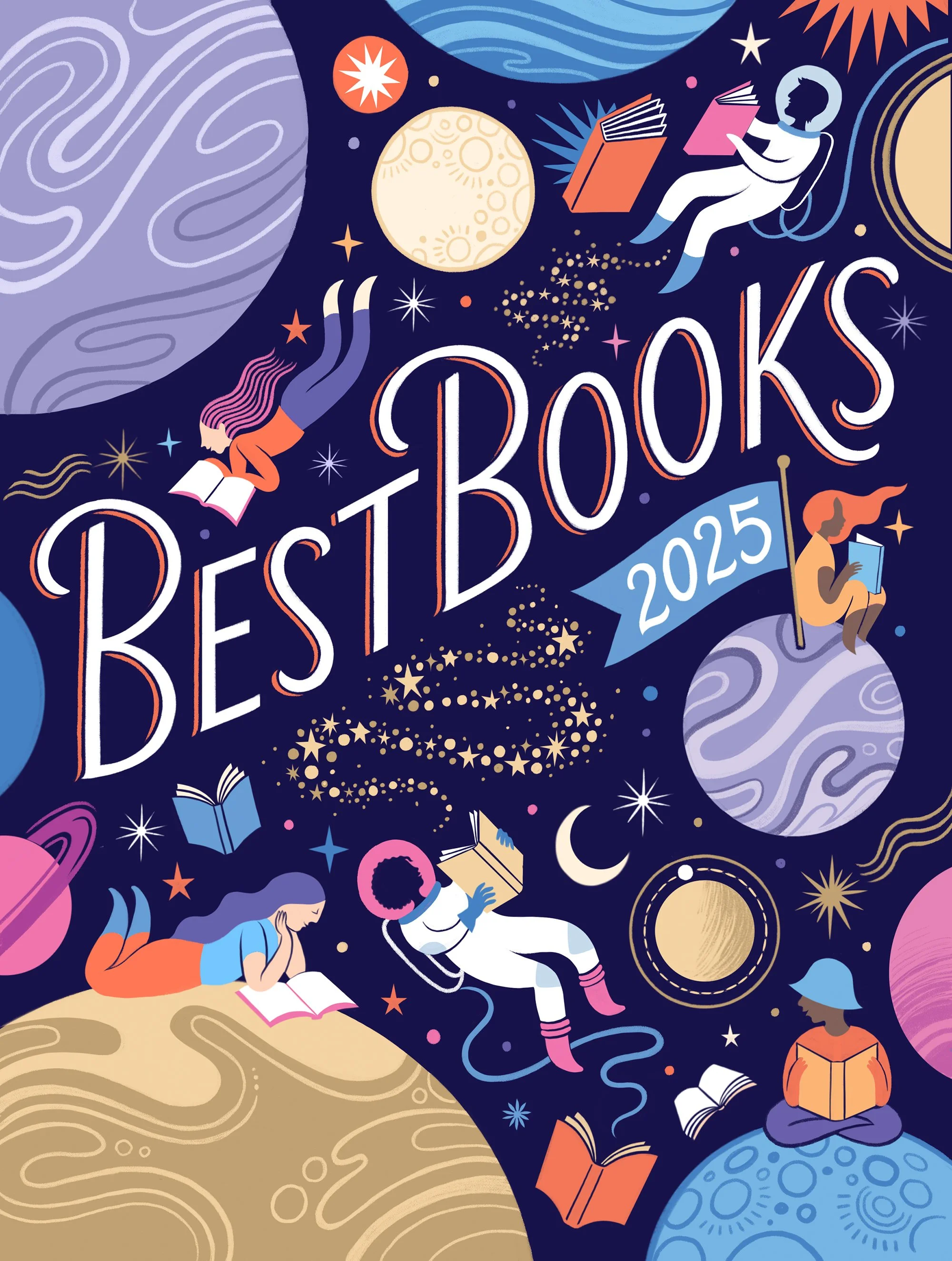
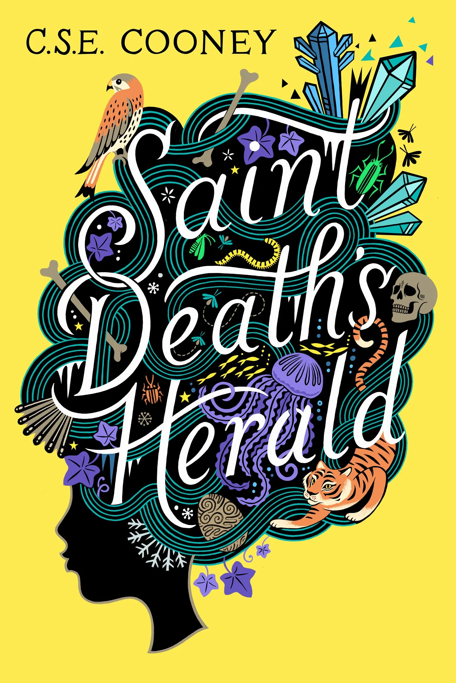
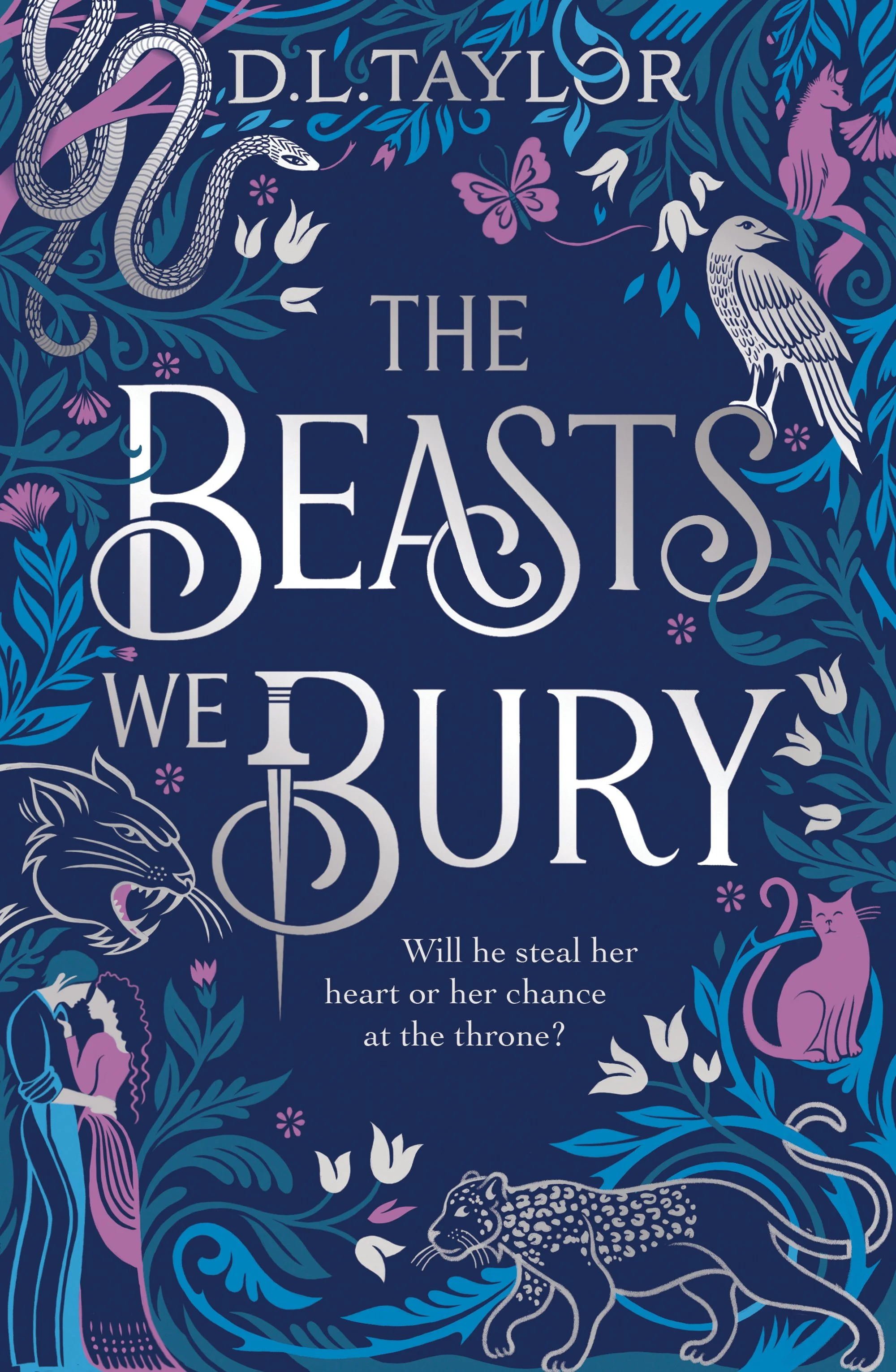
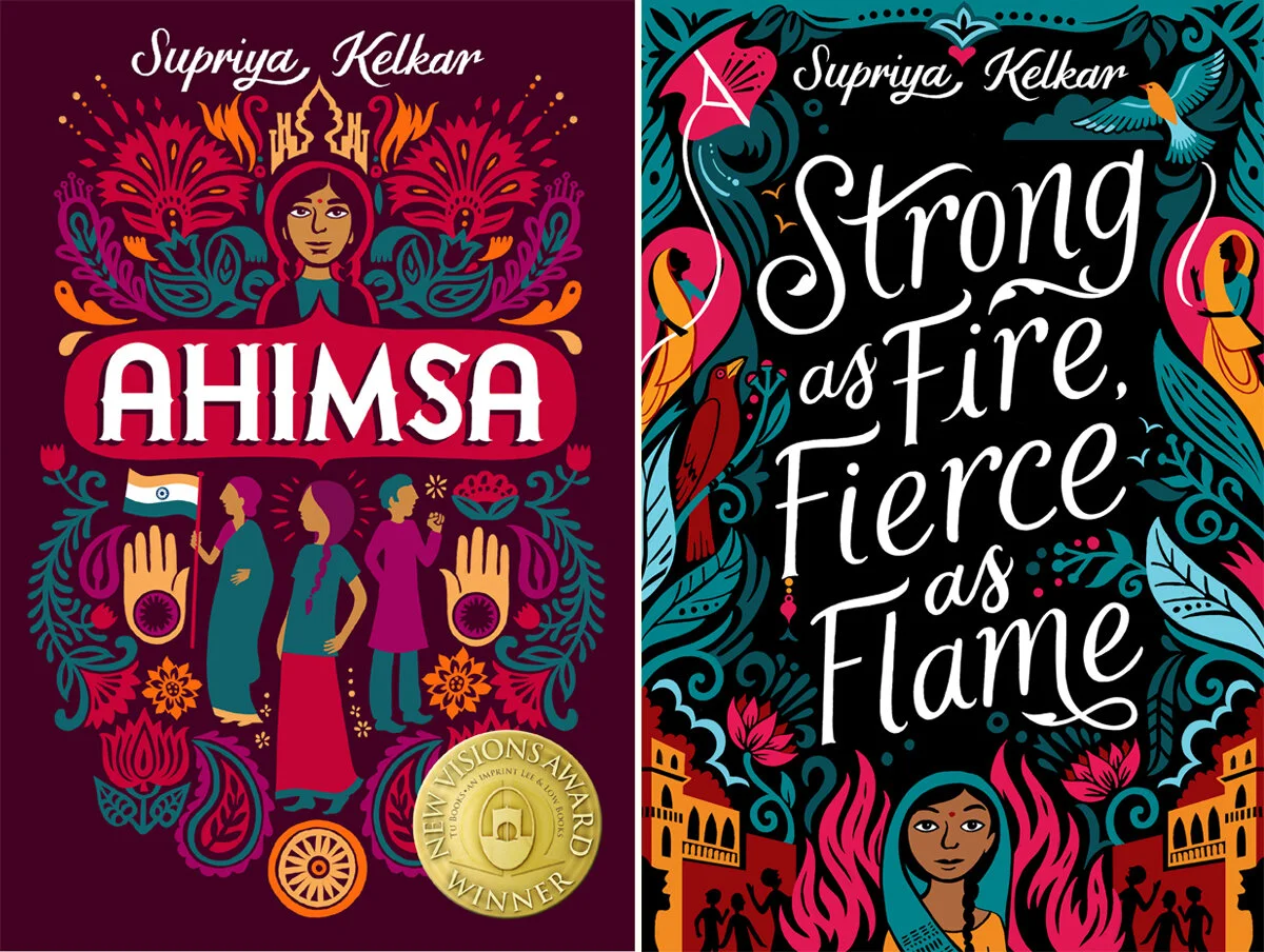
Happily, designing book covers makes up a huge part of my job. My designs are usually focussed on hand lettering interwoven with detailed illustrations. Here are just a few of my favourites…
Editorial Illustration for The Wall Street Journal
I designed this simple but intricate lettering for Hudson Valley’s latest craft vodka. In collaboration with Pavement design, we explored a couple of concepts for the brand - scroll below to see alternatives - and the final packaging was foiled in silver on a rustic grey label.
We don’t talk about mental health enough.
Let’s Talk is a collaboration between myself and photographer Charlie Clift that aims to spark millions of conversations about mental health. By literally drawing people’s most difficult thoughts on their faces, we hope to inspire others to open up about their own mental health. We invited volunteers from all walks of life, plus a few well-known faces, to talk about their own experiences of mental health issues. Charlie and I chose the most poignant phrases from each interview for me to hand letter onto each subject's face and then he took their portraits. The results are a set of 17 images which have become part of a nationwide campaign supported by Mental health UK.
It’s ok to not feel ok. Speak up. Let’s Talk.⠀
Giant Theatre poster commissioned by Arizona Theatre Company.
NYC advertising agency McCann called upon me to realise their joyful concept for their healthcare client, Fasenra. The brief was to draw inspiration from South American textiles, as well as culture, music, community and sport to create this colourful, narrative pattern.
Butlers Chocolates commissioned me to design two detailed patterns to be used for their packaging and gift wrap for Christmas.
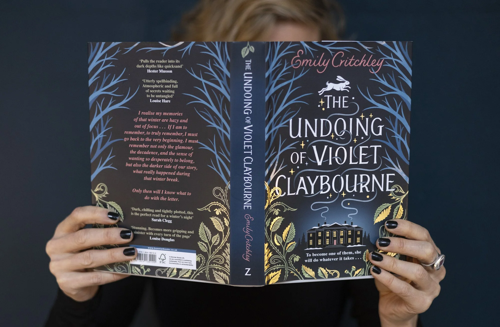
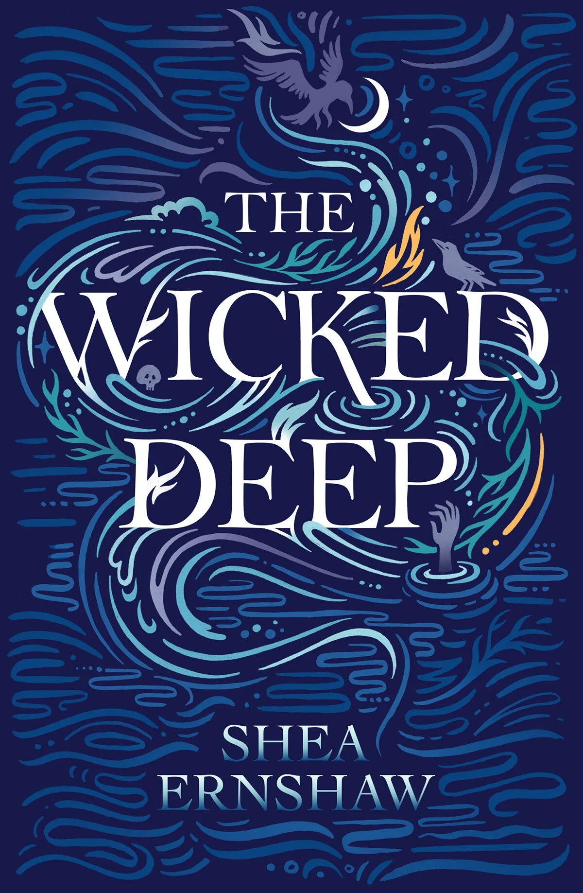
Typographic book cover designed for Simon and Shuster, the UK paperback of Shea Ernshaws haunting tale.
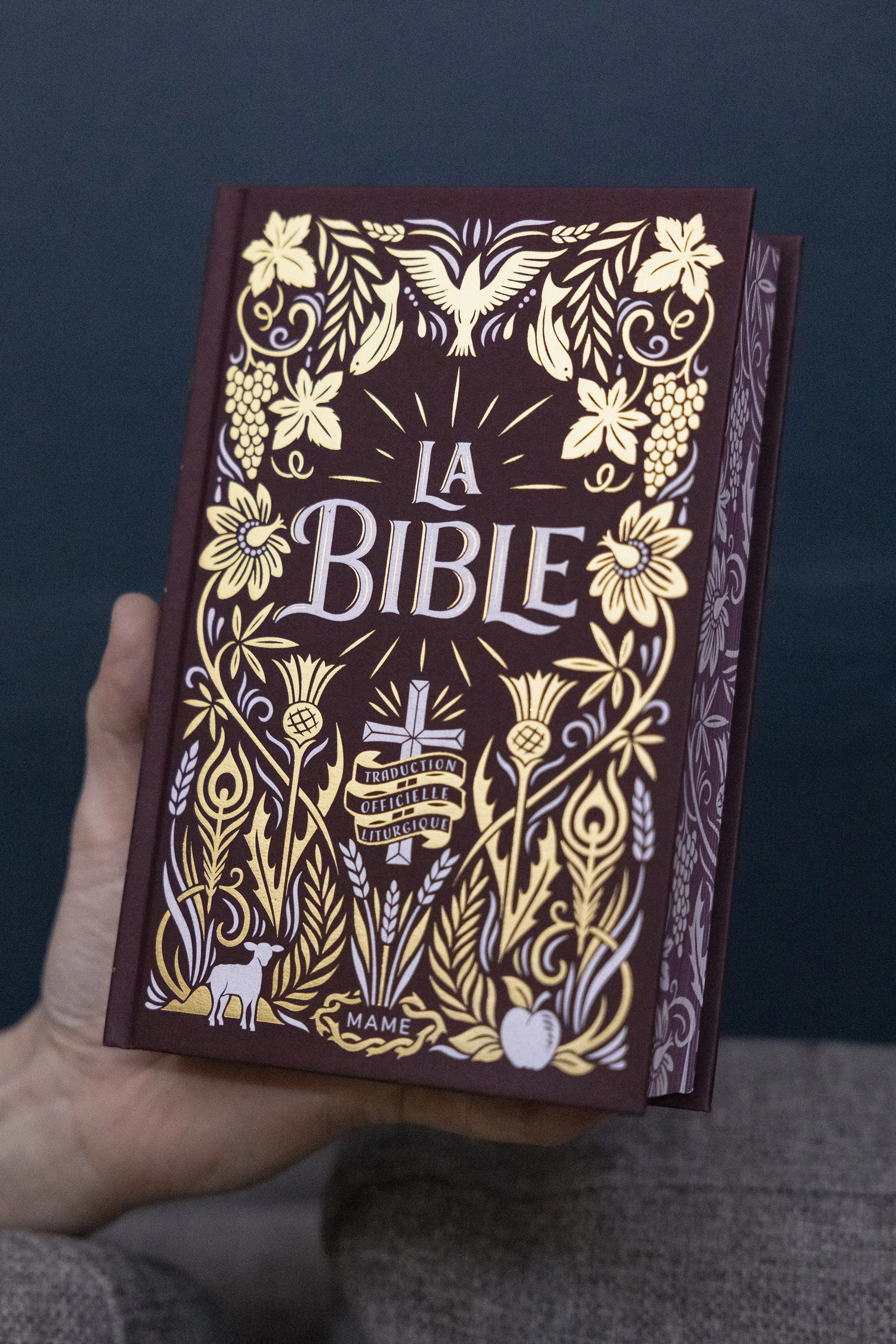
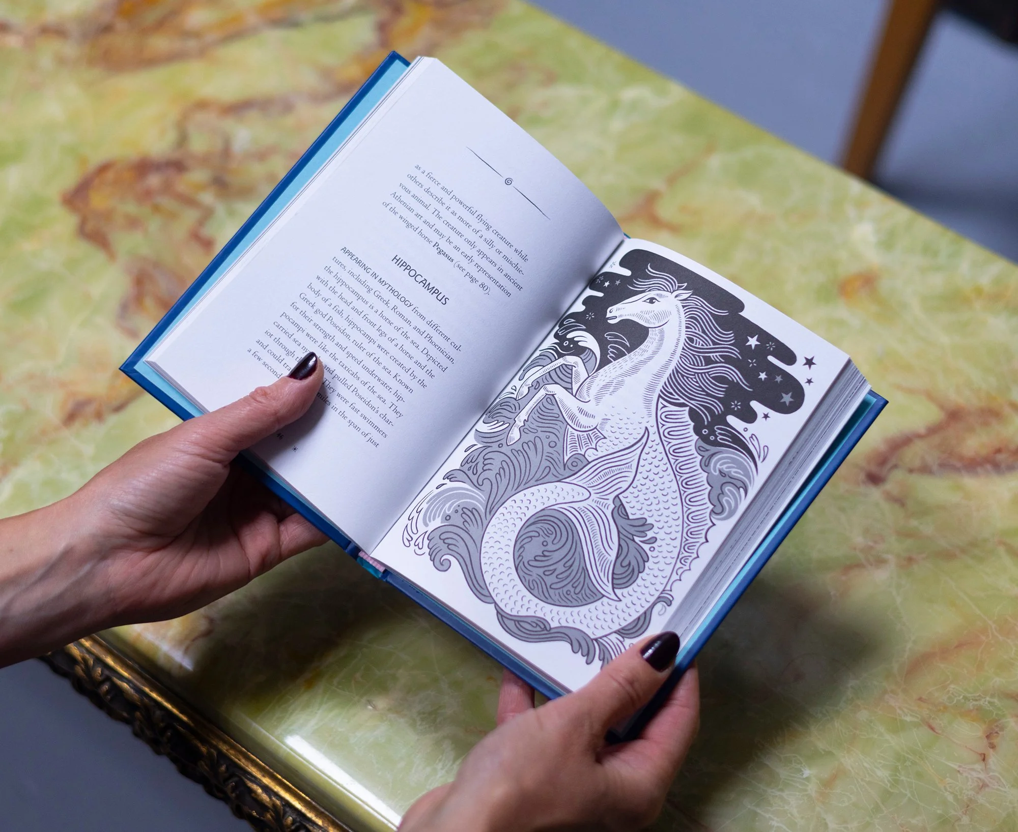
San Francisco based publishers, Chronicle Books commissioned me to illustrate this book of Celtic Tales. The book contains 16 illustrated tale of enchantment, each one with a border of intricate Celtic designs. The book is divided into chapters and each chapter opens with a full spread of illustrated knot work patterns. I designed a colour scheme for each chapter and an overall scheme running throughout the book. I also designed the cover and some intricately patterned end papers.